30. Juni 2019
Forecasting Ozone levels in London
 How high will be ozone levels in London next year? I have looked into the London Average Air Quality dataset in order to see patterns and to produce crude estimates. Here is what I learnt about ozone and discovered about roadside and backgroudn ozone levels in London.
Why look into data about air quality
I care about health (take health away and see whether what you would give to get it back!). And I am fascinated by data. It’s therefore not a surprise that I have been spending a bit time here and there in order to learn more about air quality from data. In previous articles, I posted about Energy from Thin Air: Measuring Air Pollution with CleanSpace, Air Pollution – Green, Yellow, Red: Toying with CleanSpace, Inspecting air pollution data from OpenAQ using Colab, Pandas, and BigQuery.
The London Average Air Quality Levels dataset
This time, I looked at the London Average Air Quality Levels dataset (https://data.london.gov.uk/dataset/london-average-air-quality-levels). As London is known for rather poor air quality, I am sure that this dataset is not going to be boring. Let’s try and forecast the monthly average ozone levels in London for the year. Since the dataset is getting updates over time with new readings, I will be able to look back at these forecasts in the future, and see how far off they were.
A few words on ozone
Before we look at the data and making forecasts based on past ozone levels, let us first look a bit more into what ozone levels mean. At ground level, ozone is a second level pollutant, which isn’t emitted directly by industry or traffic, but rather forms from other primary pollutants. Ozone is “highly irritating” [2, 3], and when ozone levels are high on a particular day, your may e.g. experience pain in your eyes.
The London Average Air Quality Levels dataset is summarized by the maintainers as follows:
The data shows roadside and background average readings for Nitric Oxide, Nitrogen Dioxide, Oxides of Nitrogen, Ozone, Particulate Matter (PM10 and PM2.5), and Sulphur Dioxide. Measured in Micrograms per Cubic Meter of Air (ug/m3). The spreadsheet shows which Index level each reading falls in, and contains charts showing pollutant levels by time of day per month.
Less ozone at the roadside
First, let’s explore the average ozone level per month, reaching back to January 2008. We have two time series, one for roadside ozone levels, and one for background ozone levels. Plotting the time series will give us an idea of how the time series looks like, and reveal whether there are any striking trends or patterns.
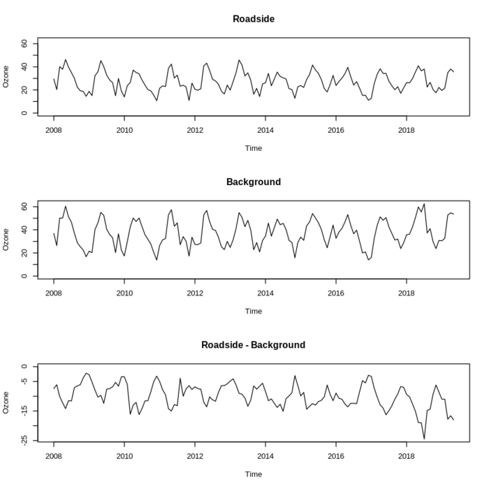
When I looked at the difference between roadside ozone levels and background ozone levels, I was surprised: the difference was negative throughout, meaning that lower ozone levels are found at the roadside. I had expected the roadside ozone levels to be higher on average. However, after some research, this seemingly paradoxical effect is explained in Why are ozone concentrations higher in rural areas than in cities?. And no, the conclusion that having more cars and more roads will lead to a decrease in ozone levels is incorrect.
Seasons matter
There is clearly a periodic pattern in the time series. This comes less as a surprise. However, it is an important aspect which I need to consider when making a forecast. A straight line won’t do! Here’s a visualization of ozone levels for every year (as of the time of writing!) in the dataset:
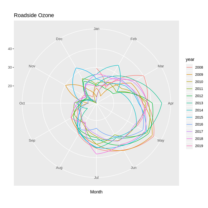
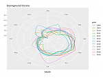
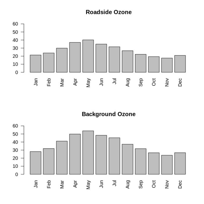
The seasonal plot above reveals more about the periodic pattern in the time series, it looks like April to July are the months with the highest average roadside ozone levels. The corresponding plot for background ozone levels (below) provides a similar picture. I am surprised in as much as I had expected July to August to be the frontrunners.
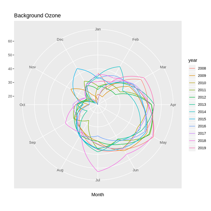
By plotting the average for each month over the whole period of 2008-2019, we can see clearly in which months London suffers from higher ozone levels.
Autocorrelation
Let’s dig a bit further into the time series by plotting the autocorrelation and the partial autocorrelation. If that doesn’t sound interesting to you, skip ahead to the forecast section. I did not know about these concepts until very recently when taking a course in “Practical Time Series Analysis” [1].
Essentially, in our case autocorrelation measures how much an ozone level for a month correlates with the ozone level one (two, three, …) month(s) ago. The time passed in between is called the “lag”. Once we know the autocorrelation of the time series, we can use that information to build a MA(q) (=moving average) model, which in turn will help with forecasting.
Partial autocorrelation, also measures correlation between two ozone levels─let’s take month t and month t-3 as an example─but “partials out” any correlation of the ozone levels at t and t-3 which is already explained by the correlation with the ozone levels at t-1 and t-2. We can use that information to build an AR(p) (=autoregressive) model of the time series.
However, both the MA model and the AR model assume stationarity of a time series. The presence of both trend and seasonal pattern in the ozone levels therefore means that this assumption might not hold. That assumption can be tested, and even if it turns out that there is a trend or a seasonal pattern (I am pretty certain about that in the case of ozone; look at the time series), there are ways to address that: by including the differences between ozone levels (dubbed “Diff” in the charts below) into the model, and by including seasonal terms in the model.
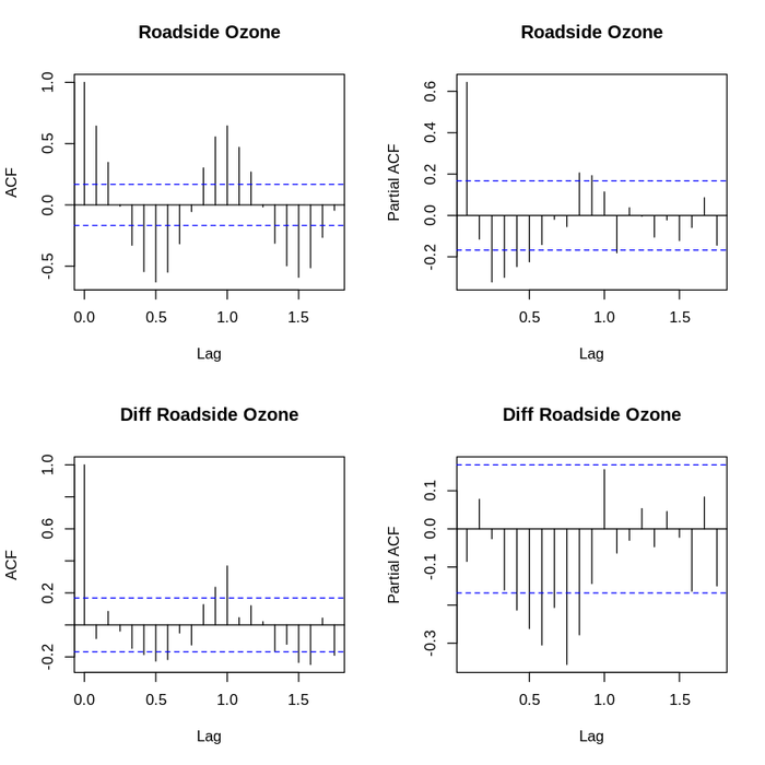
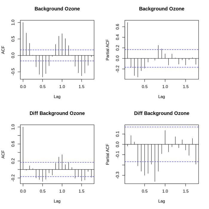
Looking at the autocorrelation and partial autocorrelation functions, we can clearly see a seasonal pattern, and it is clear that the period is 12 months. This is consistent with expectations that ozone levels e.g. in May should correlate well with ozone levels in May during the previous year. For the sake of completeness, here’s the same graphs for Background Ozone, which do not look much different:
Forecasting
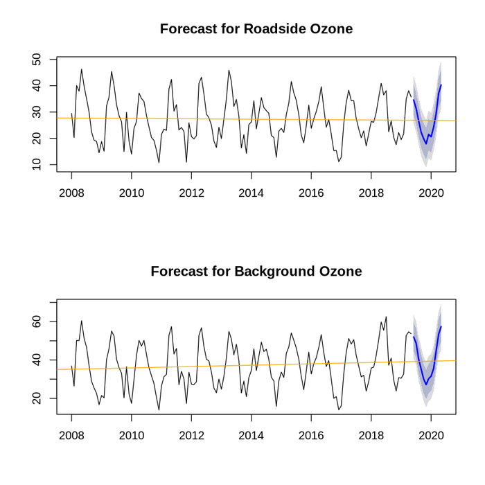
After all that pre-text, let’s go ahead and do some forecasting. I’ve used method ets of the R package forecast, which fits a exponential smoothing state space model to the time series. This model factors in trends and seasonality and hence should be reasonably well-suited for the task at hand. Remember that we only take past data from the time series as input. Here’s the forecasted values:
                         Ozone Forecast
                     Month  Roadside  Background
                  Jun 2019     34.56       52.01
                  Jul 2019     31.33       48.72
                  Aug 2019     26.69       40.48
                  Sep 2019     22.32       35.29
                  Oct 2019     19.87       30.13
                  Nov 2019     17.91       27.14
                  Dec 2019     21.50       30.26
                  Jan 2020     20.60       31.60
                  Feb 2020     24.25       35.60
                  Mar 2020     29.35       44.64
                  Apr 2020     37.05       53.35
                  May 2020     40.29       57.43
In the following two charts, I have plotted the ozone levels (in blue) forecast via exponential smoothing. Be aware that these graphs are not indexed to zero. For a comparison, I also plotted the forecasts from a linear model fitted to the past ozone levels (in orange). Clearly, the linear model doesn’t take seasonality into account but captures the trend well. Roadside ozone levels appear to be mostly steady while background ozone levels are increasing, which means bad news coming from this dataset and analysis.
The dataset appears to be updated regularly, and hence I can come back in a few months of time and compare how well the estimates match reality─I’m curious with how close I get even without a sophisticated approach (which might involve taking the right factors into account to create an even more explanatory model). Furthermore, there are more time series in the London Average Air Quality Levels dataset, providing the monthly averages of various other pollutants, such as Nitrogen Dioxide (which are involved in the formation process of ozone). Stay tuned.
[1]: Practical Time Series Analysis, https://www.coursera.org/learn/practical-time-series-analysis course course (State University of New York)
[2]: Why are ozone concentrations higher in rural areas than in cities?, http://www.irceline.be/en/documentation/faq/why-are-ozone-concentrations-higher-in-rural-areas-than-in-cities (IRCEL-CELINE)
[3]: Common air pollutants: ground-level ozone, https://www.canada.ca/en/environment-climate-change/services/air-pollution/pollutants/common-contaminants/ground-level-ozone.html (Government of Canada)
[4]: London Average Air Quality Levels, https://data.london.gov.uk/dataset/london-average-air-quality-levels (King’s College)
[5]: Box-Jenkins Analysis of Seasonal Data, https://www.itl.nist.gov/div898/handbook/pmc/section4/pmc44a.htm