3. April 2021
Swiss Trail Tour, Incorporating Objective Feedback
 Without feedback, you can only achieve what you already know how to do. With feedback, you can achieve what that you do not yet know how to do. I believe that feedback loops are at the core of any development. In this post, I am sharing my thoughts on incorporating objective feedback into long distance running training by visualizing data from Strava in Google Data Studio.
First, why look for objective feedback in running? In my case, it’s about passing the challenge I have set myself for 2021: the Swiss Trail Tour, a three-day stage race over 103 km and 6000 m of elevation gain. This is a step up from previous challenges and I must train smart in order to accomplish my goal. On this topic, I wrote posts in the past: Swiss Trail Tour, Beginning or Comeback? and Swiss Trail Tour, Training Differently.
There are a lot of decisions to make in a training season: when to train, when not to train, what to train, how to train, when to rest, etcetera. Feedback helps you to make these decisions. Feedback helps you to understand whether what you are doing is actually working. When training, there are three ways of getting feedback, according Brain Training [1]: subjective feedback (one’s own feeling), objective feedback (evidence) and collective feedback (established wisdom) . This is one of the takeaways from the book. I like thinking about feedback in this way: if you only consider objective feedback during decision-making, you will only ever incorporate what you already know how to measure; if you only consider subjective feedback, you discard any evidence available to you, and finally, if you discard the collective wisdom established over decades, you will have to painfully experiment in order to rediscover knowledge that already exists.
In this post, I am focusing on objective feedback, using activities tracked for over six years with Strava. The idea is that the data will help me to avoid being wildly wrong. At my modest level, I don’t need to look for the fraction of a percent that gives me the edge over other world-class athletes. I am a hobby athlete and not a world-class athlete. Thus, avoiding big mistakes is likely to make a much bigger difference than being right about every little thing. Consider, for example, the following statement from Training for the Uphill Athlete [2]:
“Continuity, Gradualness, and Modulation. These three words are the principles of all successful training programs. Keep these in mind as you build your program to prevent you from making gross errors.” [2]
Here is the idea. Take such fundamental principles, and provide objective feedback on whether you are adhering to these principles (or not). I already wrote about the technical foundation in
Visualizing Strava activities with BigQuery and Google Data Studio. What I wrote less about was on how to make use of the available data on past activities in order to provide objective feedback. Without further ado, let’s dive into it.
In the past years, looking at my history of races and the efforts leading up to these races, I have been pretty erratic (inconsistent) in my training. I’d race on consecutive weekends, run a lot in one week, then travel and drop most training for a few weeks until getting back into it. This is in stark contrast to aforementioned principles of approaching training through continuity (think: training consistently), gradualness (think: making training harder in small steps) and modulation (think: alternating between periods of higher and lower training load).
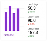
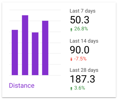
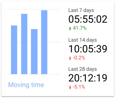
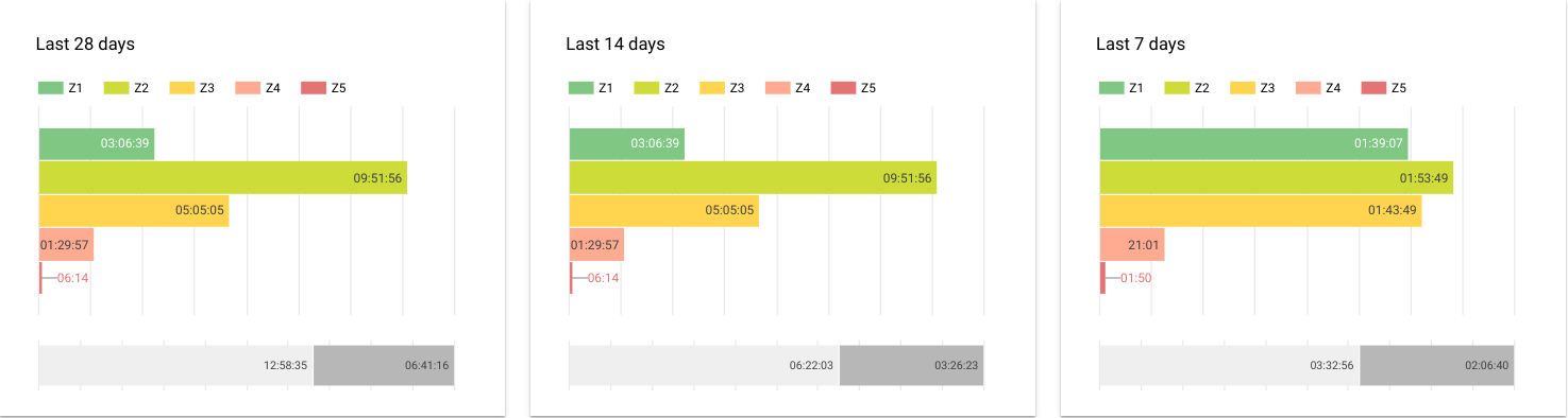
To make my future choices lead to more consistent training, I have thus created a dashboard which allows me to understand progression over short-term, medium-term and long-term periods. Since my training volume is not just coming from distance, but also from elevation gain, it makes sense to take both quantities into consideration. Summary charts show trailing averages over moving time, distance and elevation gain for the last 7, 14, 28 days, along with a comparison against the preceding period. This provides rapid feedback in whether I am currently about to increase my training load rapidly or have scheduled too little training volume. In addition, these summary charts show me the progression of these three quantities over the last five calendar weeks. This allows me to understand whether I am indeed following a gradual progression in increasing training volume, and to check that I intersperse recovery weeks in order to give my body more time to adapt to the stress.
However, looking at five past weeks (and comparison against the preceding period) is not capturing the bigger picture, which is progression over longer time periods such as the last 6 months by calendar week. Such a mid-term view is pretty important given that my training program for this ultra distance event is going to take about half a year in total.
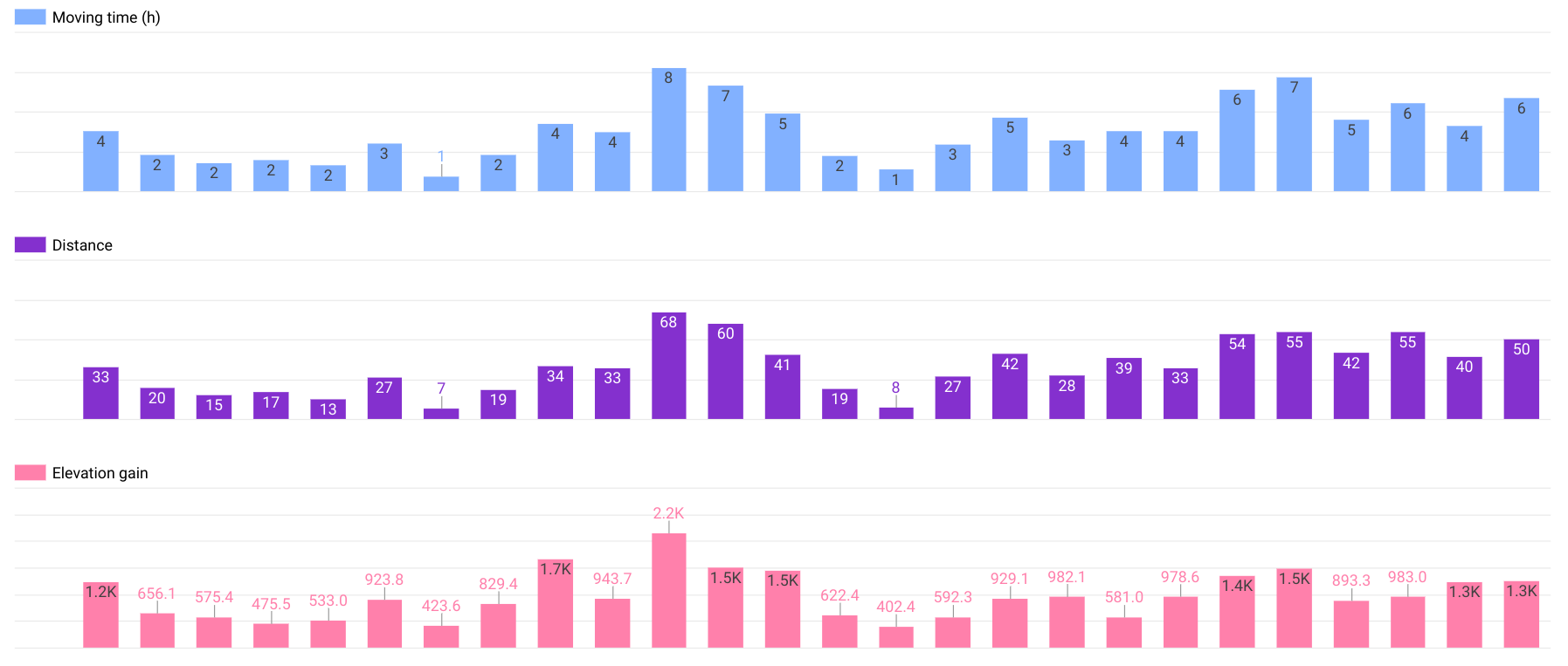
To provide an ever longer-term picture, I plot progression in terms of training volume over quarters from the beginning of time (well, the beginning of measurements, to be precise). The long-term view is less interesting on a day-to-day basis, but reminds me to look beyond “this year’s obsession” and think about progression over multiple years instead.
As mentioned in Training for the Uphill Athlete, it’s easy to make the mistake of training too much at higher intensities while neglecting the building of the aerobic base [2]. To avoid falling into that trap myself, I am thus visualizing the time spent in each heartrate zone in order to make sure that the vast majority of my running is done in heartrate zones 1 and 2, below the aerobic threshold. I would have more confidence into the data if I actually had established my heartrate zones through tests, whether in or outside the lab. Right now, I am still relying on Strava’s estimation while I don’t even know my own current maximum heart rate with an accuracy of less than ~5-10 bpm, nor do I know my aerobic threshold. Here, I clearly have my work cut out for me: testing is next!
Strava shows the heartrate zones for individual activities. But above charts show the work done across multiple activities, over multiple days or weeks. Having such an aggregated view is much more helpful in order to decide on whether to adjust training to include more/less high/low intensity work. Heartrate is more indicative of training intensity than pace because I run on undulating terrain rather than only on flat, concrete roads.
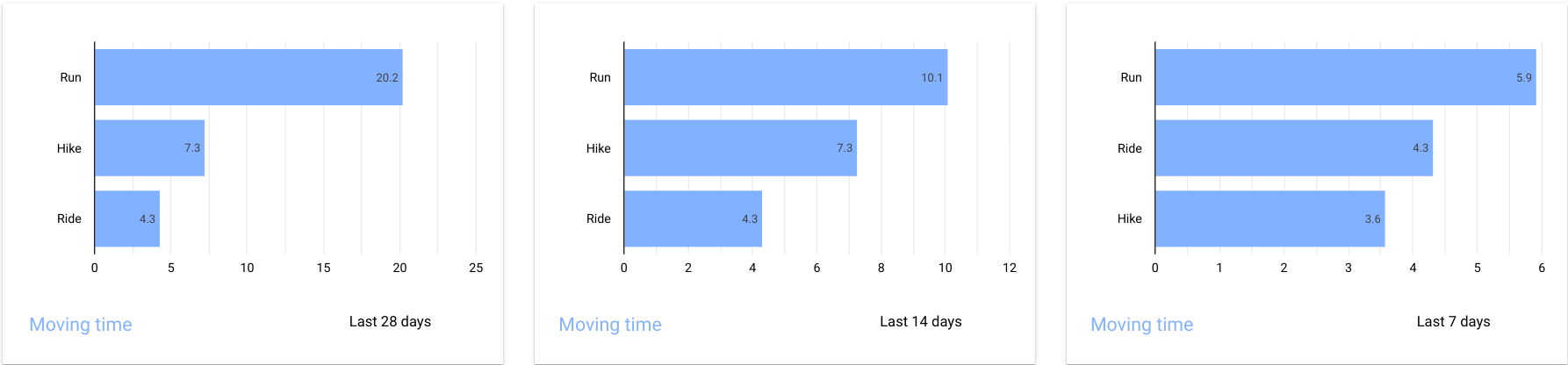
Let’s move on and look at objective feedback on cross-training. While there seems to be consensus in coaching that running is the best training for becoming a better runner [2, 3], I am wary of increasing my running volume to much more than what it was in previous years in order to minimize the risk of injury. In addition, the Swiss Trail Tour actually requires me to hike a fair bit of the distance (I have no plans to run the whole race distance). Thus, hiking actually counts as race-specific training. Furthermore, cross-training is fun because I enjoy cycling. When it comes to cross-training, the fun that comes with doing different activities, as well as the caution towards becoming too ambitious with running are way more important concerns to me than maximizing (short/medium-term) running performance.
I track training across running, hiking and cycling in order to take a more holistic view on recent training volume. For example, such feedback prevents me from getting antsy about “slacking off” about running when in fact I have put plenty of effort into hiking and cycling recently. Conversely, such feedback prevents me from getting overly ambitious in packing too much work into a week of training: recent increases in training volume can help me to slow down before I get too fatigued. Taking a conservative view on rather training too little than training too much, a weak leading indicator is better than a strong trailing indicator of having done too much.
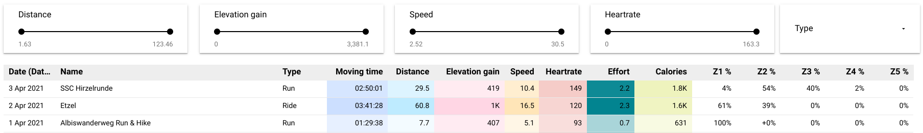
Finally, with all the aggregate charts on training, it’s still worth paying attention to the individual activities and the time passing in between (cause training happens when you rest after applying the stress). I keep a training log showing various indicators on intensity: percentage of time spent in each heartrate zone, moving time, distance, elevation gain, calories (however crude the estimate, this unit is comparable across all activity types).
In conclusion, I use the flexibility of building my own data visualizations over past sports activities in order to specifically address the areas where I feel that objective feedback is most useful to me: ensuring consistency in training volume, ensuring gradual progression, and making sure to build a solid foundation rather than seeking out the quick wins that may not last as long. Such a data-driven approach may not be for everybody, but for me it is one of the missing links between just reading about training principles and actually applying them in practice: objective feedback is closing the loop.
- Fitzgerald, Matt. 2007. Brain Training For Runners: A Revolutionary New Training System to Improve Endurance, Speed, Health, and Results. Penguin.
- House, Steve, Scott Johnston, and Kilian Jornet. 2019. Training for the Uphill Athlete: A Manual for Mountain Runners and Ski Mountaineers. Patagonia Works.
- Hudson, Brad, and Matt Fitzgerald. 2008. Run Faster from the 5K to the Marathon: How to Be Your Own Best Coach. Three Rivers Press.
Other articles in this series:
- Swiss Trail Tour, Day 3
- Swiss Trail Tour, Day 2
- Swiss Trail Tour, Day 1
- Swiss Trail Tour, Darth Vader on a Treadmill
- Swiss Trail Tour, Incorporating Objective Feedback
- Swiss Trail Tour, Training Differently
- Swiss Trail Tour, Beginning or Comeback?