7. April 2018
Misleading infographics: How Not To Bubble Chart
 I discovered a misleading infographic on mortality cause by gender in the OECD report “Health at a Glance 2017” while working on a course assignment. A few notes on how not to do bubble charts.
I recently signed up for the online course Applied Plotting, Charting & Data Representation in Python because I want to strengthen my skills in interpreting data, communicate data better, and last but not least train my bullshit detector.
To my pleasant surprise, the first course assignment was to locate a misleading infographic on the web and describe how it is misleading. I looked on various “top ten worst charts” pages to get some inspiration, however I felt I really wanted to discover a misleading infographic by my own. I will spare you the details but I stumbled by accident over the OECD report “Health at a Glance 2017” (http://dx.doi.org/10.1787/19991312), containing exactly the misleading infographic I needed.
The infographic caught my attention becauseit looked odd with lots of colorful bubbles arranged in two trombone shapes, one to the left and one to the right. The title was “Main causes of mortality by gender, 2015 (or nearest year)”. Have a look at the infographic in context, or look at the excerpt below:
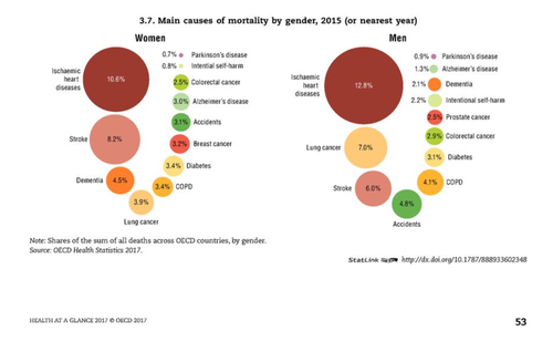
Source: http://dx.doi.org/10.1787/888933602348.
Do you spot the problem with the infographic? Don’t have the patience to look at it any longer? Let me give you a hint:
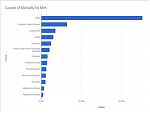
The biggest bubble shown for the main causes of mortality for men has “12.8%” (ischaemic heart diseases) whilst the second-biggest bubble is labeled with “7.0%” (lung cancer). However the 12.8%-bubble has roughly four times the area of the 7.0%-bubble!
What you would expect is the 12.8%-bubble to have 12.8 / 7.2 ≈ 1.8 times as much area as the 7.0%-bubble. But this only works if you scale the radius of the bubble with the root of whatever value you want the bubble to represent: this way the area of the bubble scales linearly with the value. It turns out that this is a classic mistake. See https://en.wikipedia.org/wiki/Bubble_chart). This is a good example, why we need to remain alert and sceptical when looking and interpreting data.
There are other issues with the infographic. For example, if you add the percentages, they do not add up to 100%. This is because there is a category of “Other” causes of mortality which is hidden from the graphic. I argue that this is misleading, too. Finally, the arrangement of the bubbles is distracting. Usually the location of the bubbles conveys information, too. Here the trombone shape conveys nothing that helps me to interpret the data.
So how could you plot the data instead? While I did not go the full length of recreating the whole infographic, I just opened a spreadsheet, and created a very simple horizontal bar chart. This bar chart clearly shows the ratios between the different causes of mortality (with no need of shaded colors: no data is omitted, and the layout serving a purpose):
I have notified OECD of the issue with the bubbles used in a misleading way because I feel bad sitting on the sofa and critizising other people’s work; also the constructive way is to send the feedback right to where it belongs. I will update this post in case I receive a response.